Mobile typography is a branch of the art of typography, dedicated to the set of rules for the most convenient perception of printed information on portable devices.
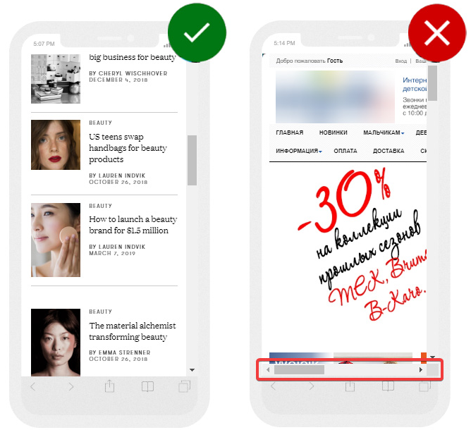
In the example below, the mobile version of the website is displayed on the left with easy to read fonts, and all information is placed within the screen width.
The text on the right side is too small; an unsuccessful font for promo offer is used. There is a horizontal scrollbar since the website is not adapted for mobile devices:
The website content on mobile devices should be displayed in such a way as to ensure easy loading, clarity, and readability. At the same time, it should have easy to use features so that the user can carry out all the necessary actions on a smartphone just like he'd do it on his PC.
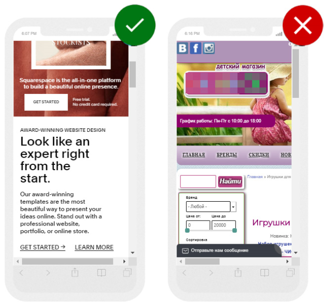
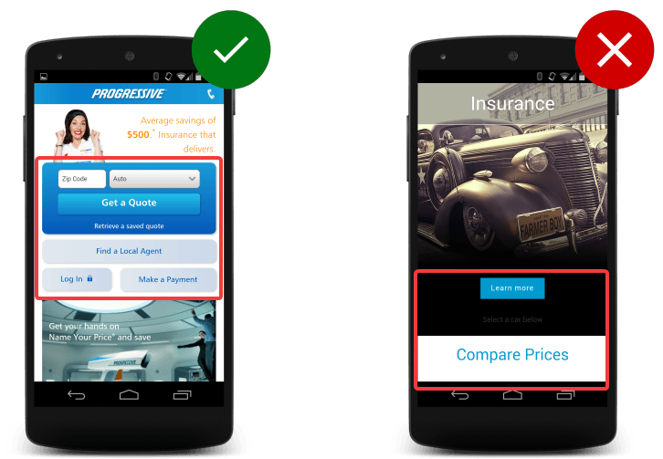
In the example on the left, all conversion buttons are located in a visible place; they are quite large. The website on the right uses too small fonts and non-responsive design:
The basic principle of mobile web design is to provide the user with the necessary functionality without overloading him with unnecessary information and calls to action. The mobile version website content should be easy to read through so that you can get back to some point and read it in detail.
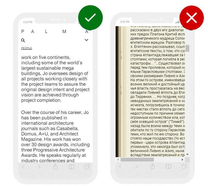
The example on the left uses a readable font for the main text, the length of the line, and the division into paragraphs facilitate easy perception of the material. The text on the right is not divided into paragraphs; the font is too small. It's very difficult to read such content using a mobile device:
You need to pay attention to the following elements while developing a mobile version of a website.
Font size
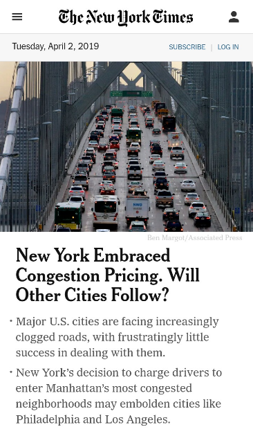
Recommendations differ depending on the operating system used. However, in any case, the font size should be easy to read:
Experts recommend to use the following font ranges:
- for user input and body text: at least 16 px;
- for less important text: 14 px;
- line spacing: 24 px.
Since everyone has different devices, eyesight, and viewing conditions, it's worth considering that you still won't be able to make a single ideal option. Therefore, we need a sweet spot in the middle which can be determined by testing. Ask colleagues or users to go to the website on their device and give feedback.
Also, depending on the topic of the website, it is worthwhile to understand the conditions under which people read published articles, for example, in public transport or while heading to work on foot. You can see this in the analytics (viewing time). If the main traffic comes in mornings and evenings, it's clear that people visit the website on their way to work and back.
Find more detailed instructions from the information posted on Material Design .
Empty space
There must be spaces between lines, paragraphs, letters, and words to easily read the text:
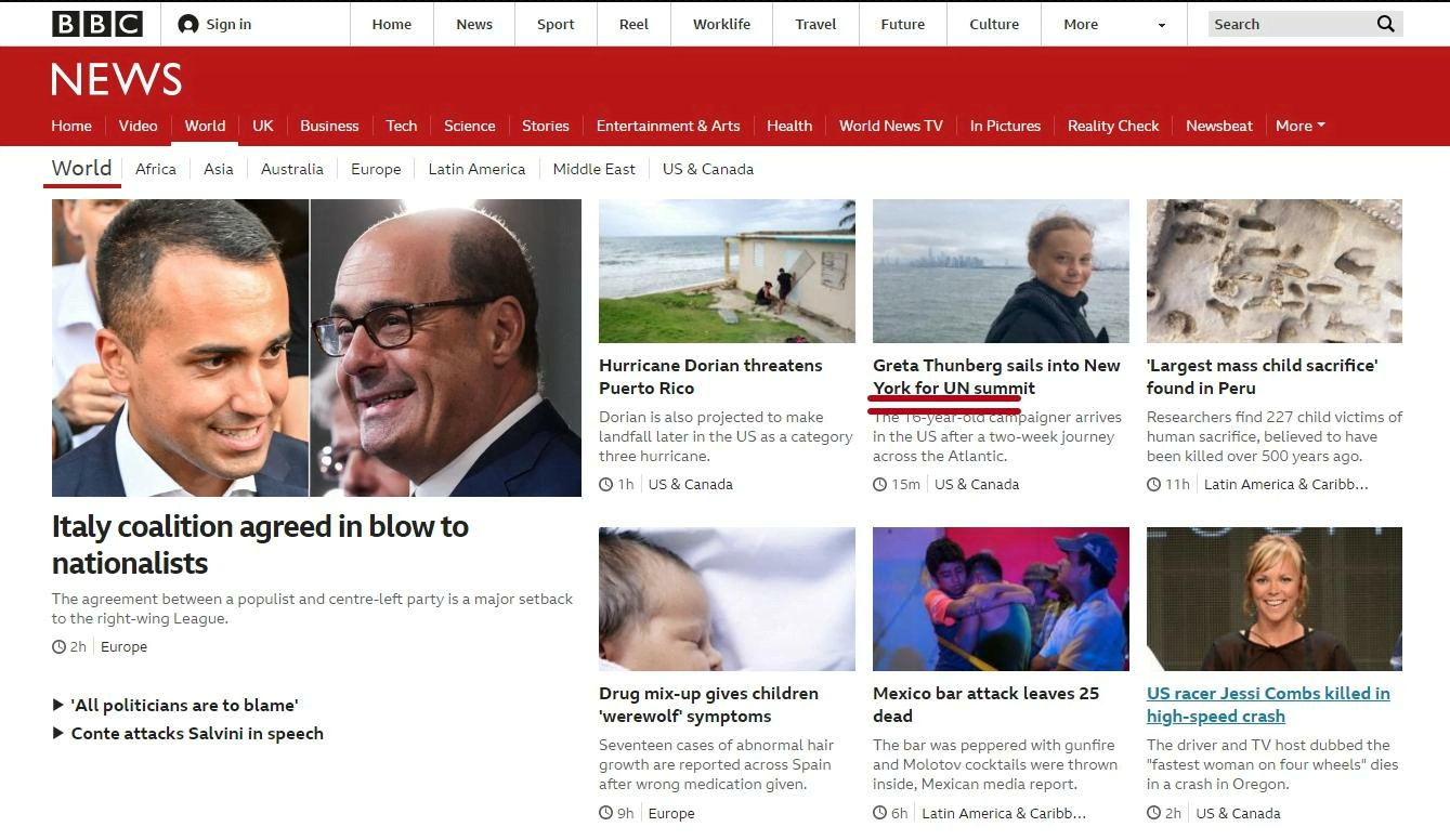
Lack of decorative elements
Fonts must be selected without unnecessary decorative elements that can make reading difficult on a small screen. You should also remember that certain operating systems use different font families. For example, Apple traditionally uses San Francisco fonts:

Line length
It is preferable to use short lines, 30-40 characters would be ideal:

Color combinations
The mobile version of a website must have correctly selected color combinations that contribute to the perception of information. Monochrome color combinations are used most often:
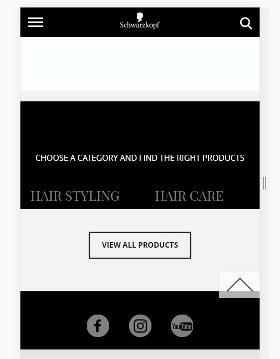
Headings
For mobile devices, the same level headings are best suited to divide information into semantic blocks without a complex hierarchy. This structure is appropriate for quick reading and searching for the necessary information:

How to see what devices are used to visiting your website
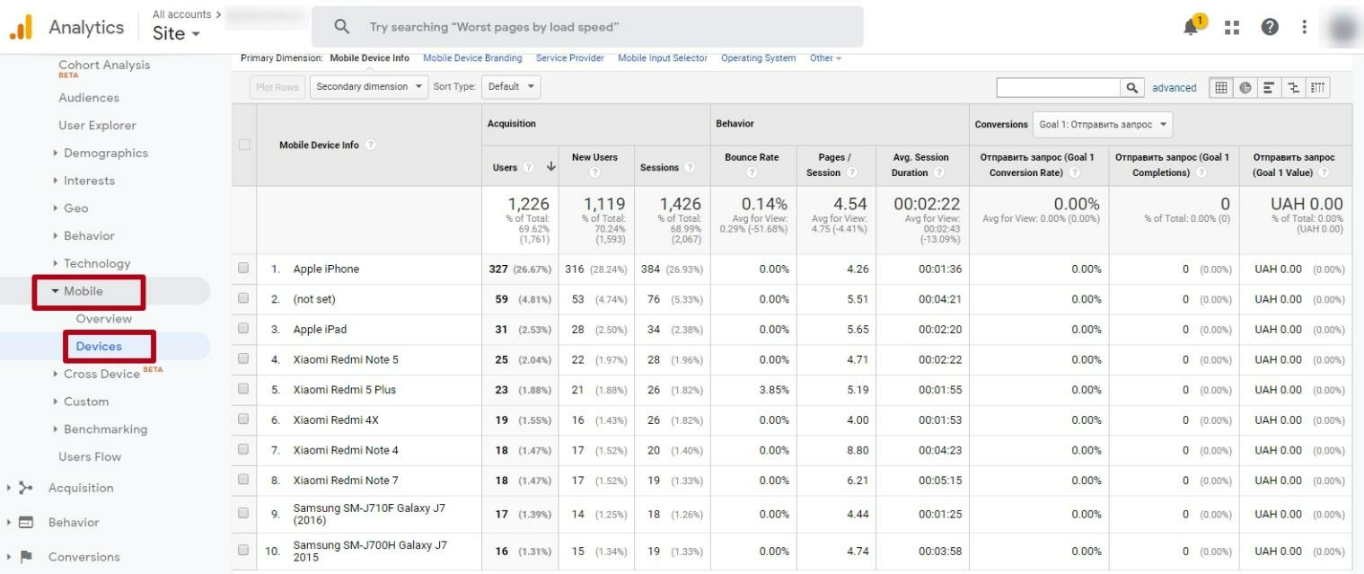
Before you understand how the content on the site should look like on mobile devices, you should analyze from which devices users access it. You can see this in Google Analytics , "Audience" - "Mobile" - "Devices":
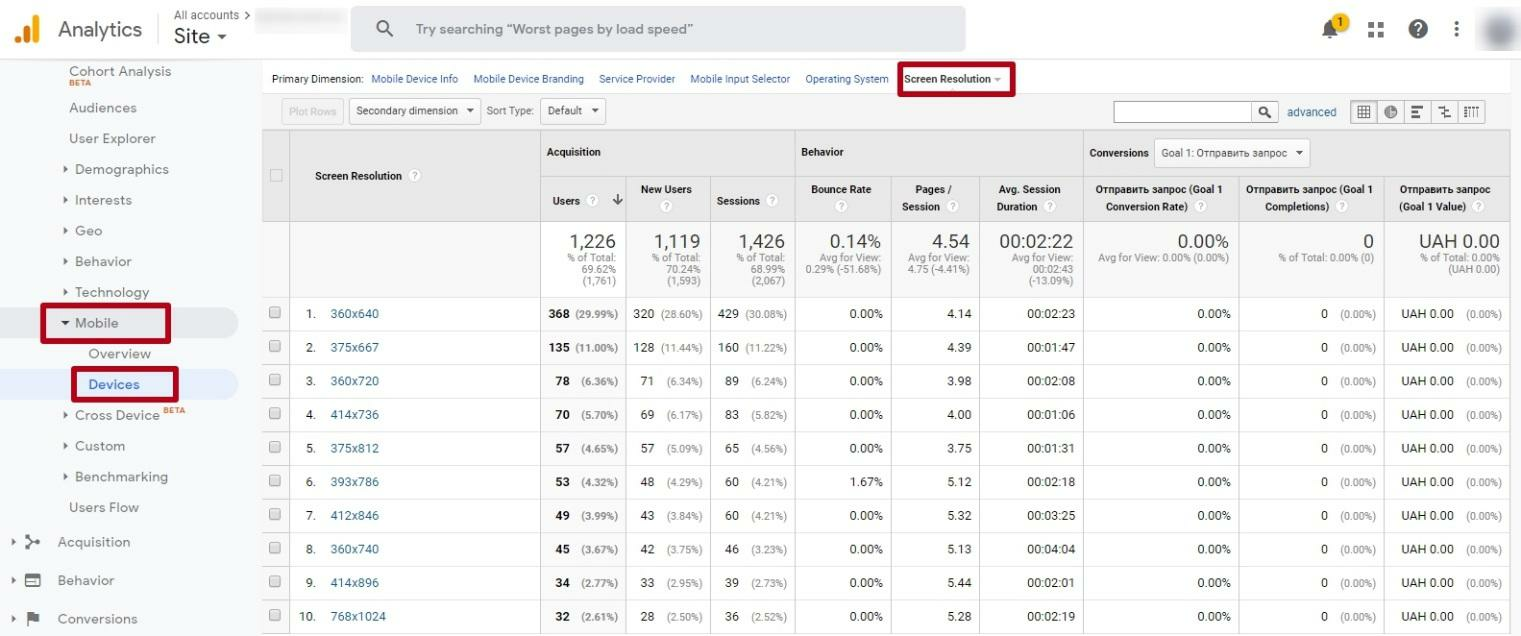
Besides models, you can also see the screen resolution of the devices used:
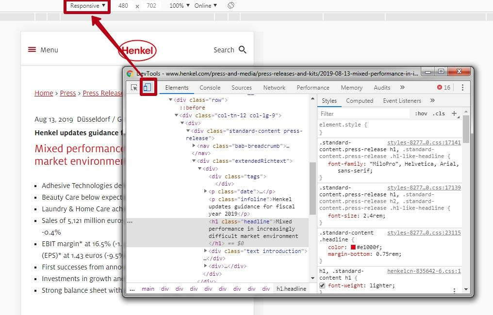
You can check how your site looks on these devices in Google Chrome settings in the developer mode. Go to settings, then select "More tools" - "Developer Tools":
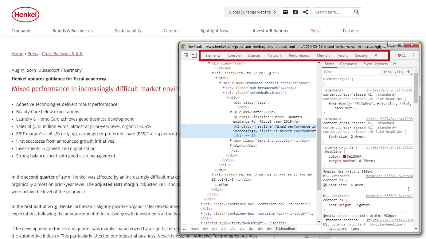
Here you can select the desired device or specify the resolution:
How to set the font size for mobile devices in CSS
Media queries are special codes that allow you to prescribe display rules for certain ranges of screen resolutions in CSS.
The font size for mobile devices should make it easy to use the touch screen without causing inconvenience when clicking the links in the text. It is also necessary to choose a suitable line spacing to ensure the readability of the text.
You can place media queries in the following ways:
- inside the HTML page using the <style> tag. In this example, a font of 16 pixels is set for mobile devices with a screen width of up to 500px:
<style>
@media (max-width: 500px) {
body { font-size: 16px; }
}
</style>
- in an external CSS stylesheet this option is preferable:
@media (max-width: 500px) {
body { font-size: 16px; }
}
You can also add a line-height value that defines line spacing. You can set it as a percentage, pixels, points, or use multipliers or multiply the current text size. For example, a value of 2 in this example means that double line spacing is set for mobile devices:
@media (max-width: 600px) {
 body {
    line-height: 2;
   }
An appropriate size of the buttons for mobile version websites
The main requirement for the buttons in the mobile version is the size that allows them to be easily pressed on the touch screen. The research showed that the most preferred size of buttons with icons for mobile devices is within the range from 42 to 72 pixels (11-19mm). The best option is 60px (16mm):
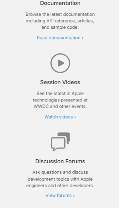
If the target audience of the site is older people, then it's better to use the maximum size of the specified range, i.e., 72px.
Using different sizes, you can indicate the degree of priority of the button. For example, use buttons with a maximum priority of 72px and a minimum priority of 42 px. You should also set the appropriate distance between the buttons, which is calculated based on their size:
- 12-24px (10-13mm) for large buttons;
- 24-36px (6-10mm) for medium-size buttons;
- 36-48px (3-6mm) for small buttons.
For text buttons, similar height standards (42-72px) are used, only the width will be different. The space between these buttons for optimal visual separation should be at least 12px.
Besides, you should place the conversion buttons in the middle of the screen so that they are clearly visible:
What fonts to use for the mobile version
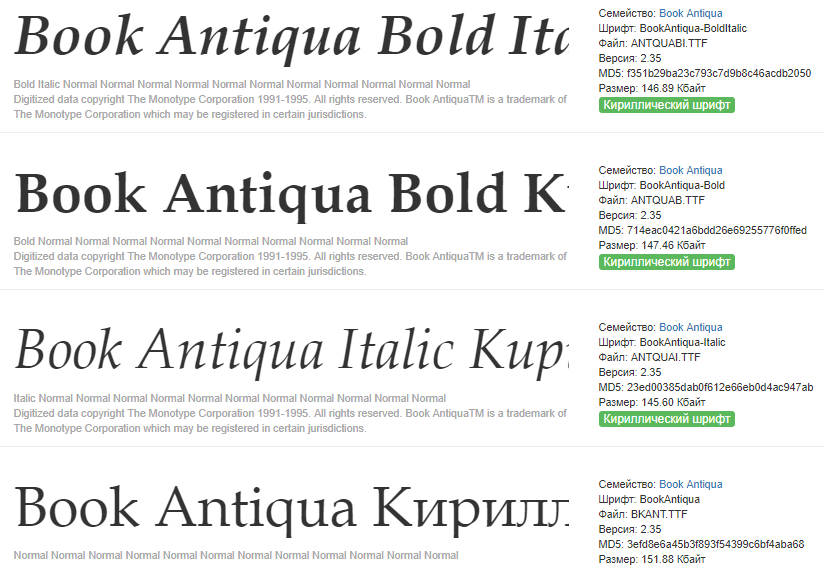
Experts recommend using standard system fonts for body text and buttons. For example, Book Antiqua :
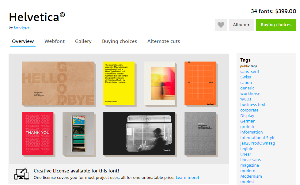
Another popular font family, distinguished by its concise and legible style is Helvetica :
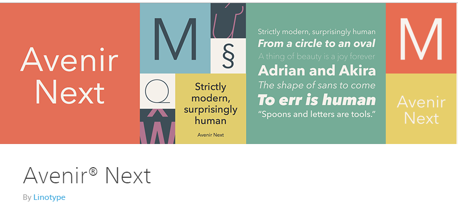
To emphasize the individual style of the company, it is worth highlighting the headings with branded fonts, for example, Avenir Next :
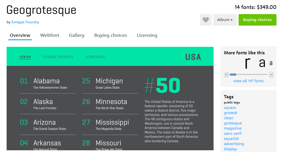
The Geogrotesque font is also suitable for headings and highlighting large numbers:
You should not use more than three fonts on one page in the mobile version, because it can slow down the download speed.
Conclusion
- In the mobile version, the content should be presented in a convenient form that facilitates quick reading and easy use of all the necessary functions.
- To avoid problems with usability, important conversion buttons should be located in the most visible place and have easy to click size.
- For the mobile version, fonts should be legible and readable. The minimum size of the main text is 16px.
- Standard system fonts should be used for the body text, while headings can be highlighted with more creative branded fonts.
- The size of buttons on mobile devices should be between 42 and 72 pixels. In this case, the buttons with the highest priority can be larger than the others.
