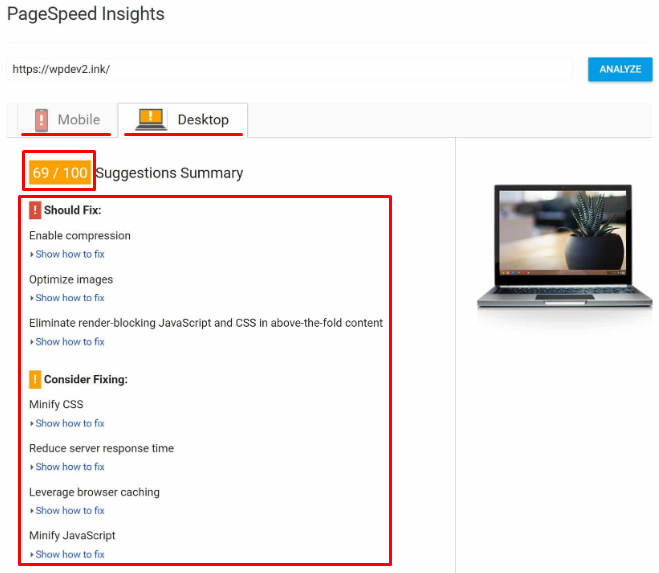
This is especially important for users of mobile devices which usually have lower performance and Internet speed compared to desktops.
Conclusion: to improve the page ranking and reduce crashes on the users' side, it is required to at least use image compression for mobile devices. Ideally, all the images on a website should not interfere with the perception of basic information, be useful to a reader and not slow down the page loading.

You can also check page speed and receive recommendations on its optimization in Risify.
How to compress pictures for mobile devices
Imagine that a person is loading a page of a website on their mobile device. While pictures inserted in different sections of an article are loaded, the text automatically moves down the screen.
When scrolling a page, a user may accidentally click on a link that will move from another part of the page. As a result, a visitor will be annoyed not only by the long loading of a page but also by the text skipping over it. Therefore, you must not neglect image optimization.
You can find standard image formats on different websites:
- JPEG — photographs and images with smooth transitions of colors;
- GIF — simple logos, signs, charts, diagrams, and animations;
- PNG — signs, logos, and graphs with lots of shades;
- SVG — individually developed logos and vector images.
All of these formats can be compressed using online tools and stationary programs as well as adding queries to the HTML code of a website.
You can immediately upload thumbnails of images with the ability to enlarge to the maximum size when clicked to reduce the resolution. The easiest way to do that is via plugins, for example, Lightbox for WordPress.
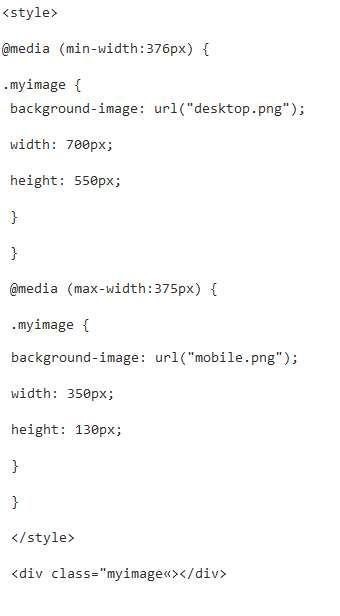
You can also set the size of the image in HTML using the query:

But what if all the pictures are already loaded and it is physically difficult to do everything manually? Use scripts in this order:
- first, you need to collect all the styles:

- reduce images specifying the desired size:

- compress and move images to another directory:

2. Compress images. This is done manually using online tools or stationary software. For example, Optimizilla or TinyPNG . Image compression for mobile devices can also be done via server commands:
For JPEG:
- JpegTran eliminates metadata;

- ImageMagic specifies the quality parameter for compression.

For PNG:
- PngQuant compresses an image by reducing the number of shades. As a result, its quality is slightly deteriorating;

- PngCrush compresses an image and does not affect its quality.

3.Activate Google developer mode — PageSpeed module which is suitable for Apache and Nginx servers and has a set of functions for optimizing images.
You need to install and activate the module through this command:

4. Switch from the jQuery library to a lighter version. For example, Zeptojs . It makes no sense to use the old heavy library which puts additional load on mobile browsers.
5. Use data caching. After creating an image cache, each time you access the page, the browser will download the saved copies of the images without losing the time to download the original versions.
6. Refuse GIF animations that significantly slow down the page loading speed. If you need to use short videos in your text, use HTML5 which is supported by most modern mobile browsers.
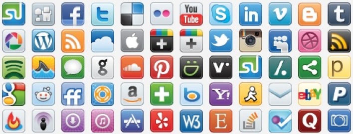
7. Create CSS sprites of icons. In the usual format, downloading each icon means a separate request to the server. Creating combined sprites reduces the number of requests to the server and therefore reduces the page weight.
Here is an example of a sprite:

What is Responsive Web Design
Responsive Web Design is a single version of a website that automatically adapts to different devices. This is a simple resource design with a flexible image size, which varies depending on the device used.
RWD eliminates the need to create multiple versions of a website. In fact, responsive design is only useful when using modern devices with a high level of performance.
After configuring RWD, pictures automatically change their format within the screen. But the image weight on the server remains the same. A user with a powerful device and fast Internet connection will not see the difference. If a person visits a website from a simple smartphone with a slow Internet connection, they will have to wait until the images, backgrounds, icons, and logos are fully downloaded from the server. So, you still have to manually reduce the pictures for mobile devices.
Conclusion
Image optimization for mobile devices means:
- reducing their resolution;
- compressing their size;
- caching;
- combining icons into CSS sprites.
If you do not resize images in HTML, the page weight will remain large. A user will have to wait a long time for the page content to load, and the search engine will decrease the ranking of such a site in the search results.
Use online services and server commands to automatically compress images. You can also use the Lazy Load effect of gradual loading when the text is displayed immediately and images are loaded as you scroll down the page.
